Low Stakes Stats · Chapter 1
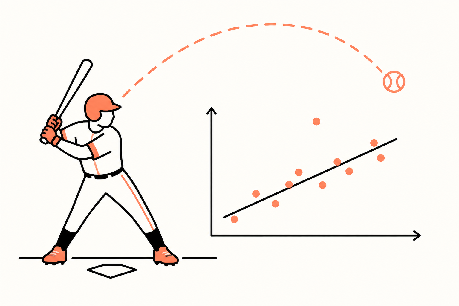
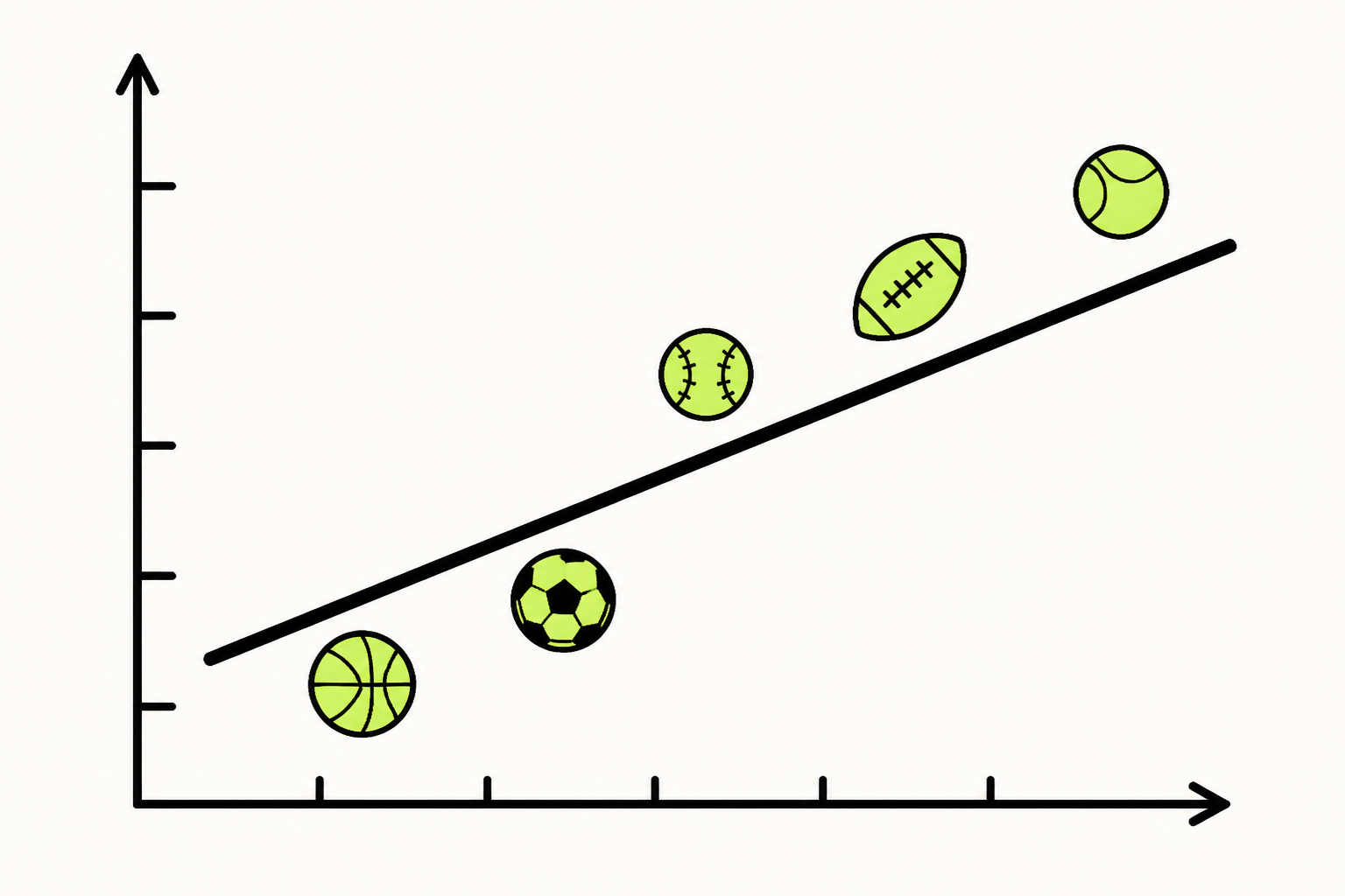
Can home runs
predict runs?
We're going to answer that with one straight line — built by hand, from six baseball teams, one number at a time. No jargon left floating. First, the short primer so the example actually makes sense.